
Meaghan’s Color Studio: Business Cards
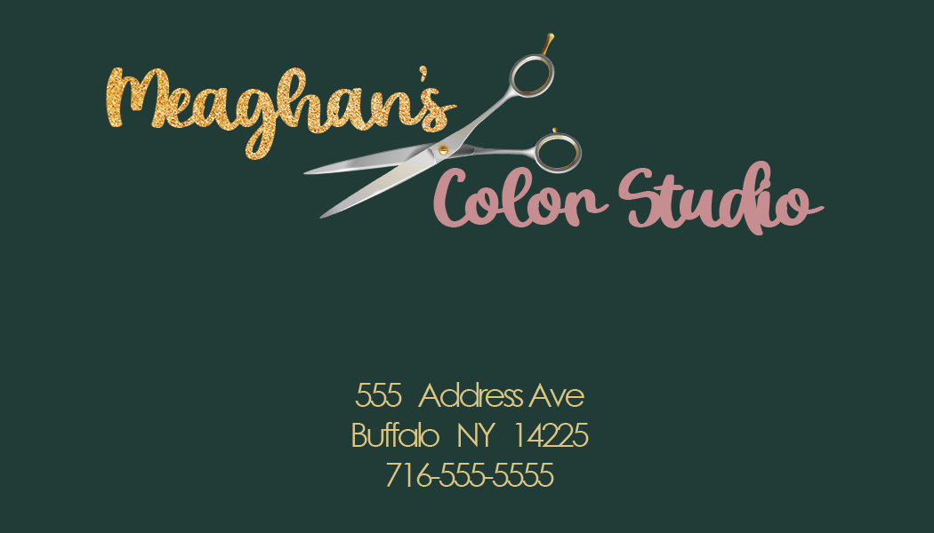

The business cards were created in Adobe Illustrator. The business cards were updated to minimize texture and enhance readability. The first business card with a solid background was used to minimize chaos since the font was cursive and implemented a glitter texture. The font was changed and altered to a bolder cursive with increased spacing in-between letters. The address here was center aligned to increase flow and readability. Since the background is a solid color, I utilized imagery, a pair of scissors which also acts as a “divider” between the word “Meaghan’s” and “Color Studio”.
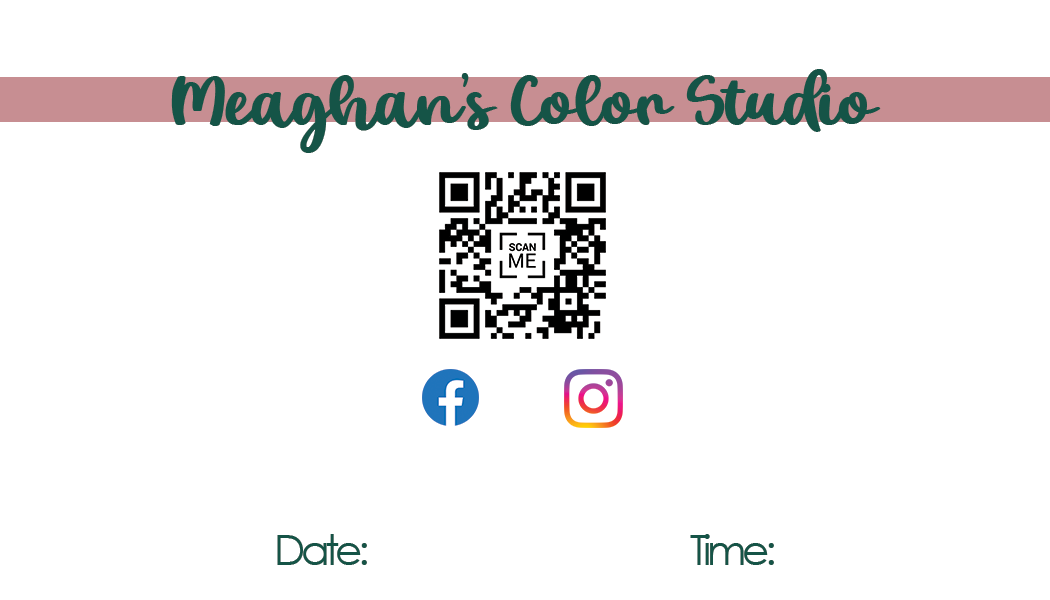
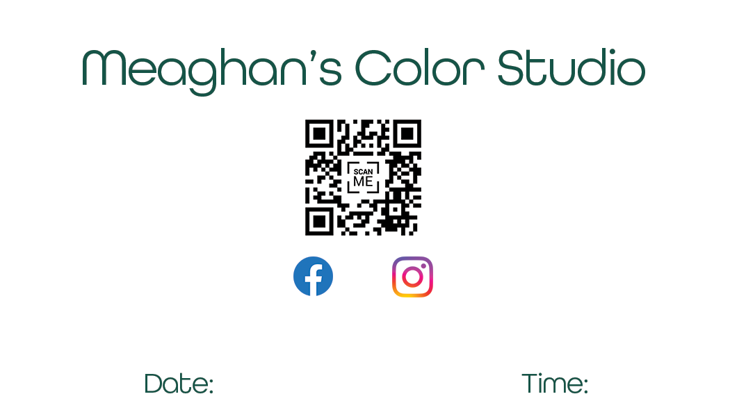
The alternate business card has a gold and pink marble background with a lower opacity to help with readability. The text was changed to communicate a modern chic aesthetic and the color of the font was changed to a solid green color so that it would not interfere with the background and maintain readability. The backside of the business cards was updated accordingly with matching font and color to keep consistent branding and flow. The client wanted 3 colors for her branding, dark green, pink and gold. I first created a few rough simple designs and only added to the designs from there based on client feedback. There were several revisions between the client and myself as this was the first ever client project that I completed. The font selected, colors and placement were executed in a way that improved flow, interest and readability.