
Town Restaurant: Menu and brochure
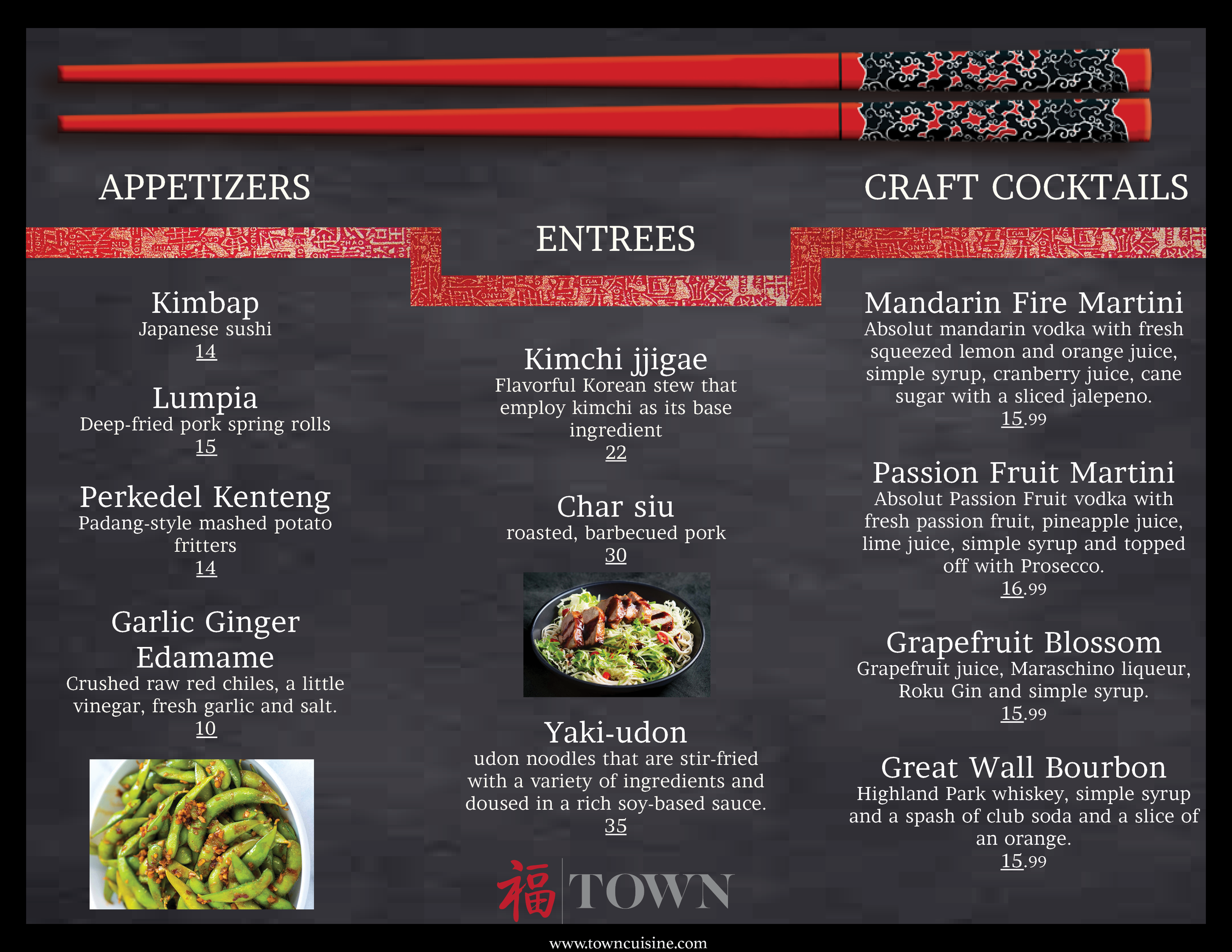
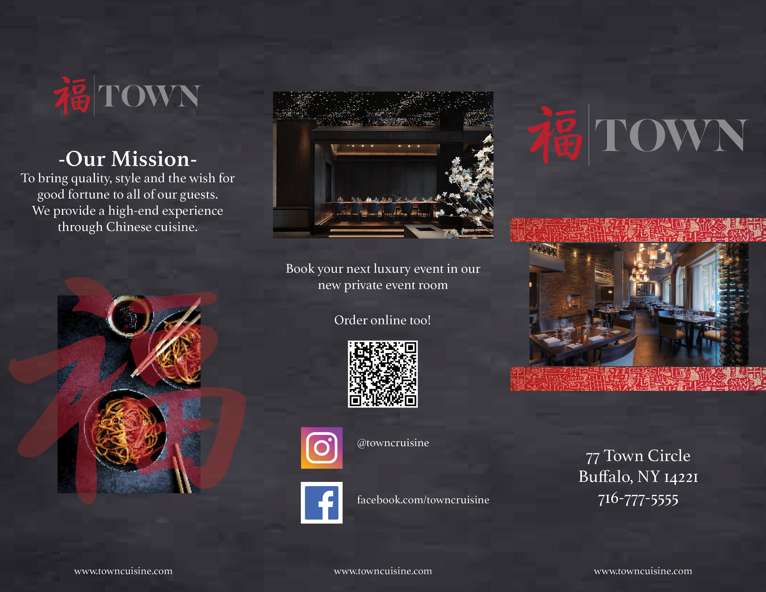

I utilized Adobe InDesign to design this project which allowed me to create an ideal layout of the print Town Restaurant brochure and table menu. I edited the font color and font here to ensure maximum readability against the background and updated graphic images, so the project remained consistent and cohesive. I utilized contrast by setting the background to a dark image and used white text on top. I then placed images as borders and implemented photos throughout to create visual interest.
For the table menu and the menu side of the brochure, I included the same image of chop sticks to help tie in both pieces to help maintain consistency. For the table menu, I added an image of sushi at lower capacity to create intentional asymmetry with this design but to also create visual interest in the menu to build curiosity from the audience. I also changed the font to something that was more on brand which also maximized readability. I also underlined each menu item title to help with separation and enhance the flow. For the brochure, I changed the font to the same font as the table menu to keep cohesive and consistent branding. The brochure opens to a full menu on the other side, which incorporates photos and imagery throughout building interest and generating good flow. The “Cocktail” section was updated to show the same alignment and layout as the rest which creates a cohesive design.